1. Engage Your Audience
People are the key to unlocking your Tableau dashboard’s true potential and transform your business into a data-driven organization but a lot of the time people don’t seem to understand their needs or in some cases are actually afraid of data.
Start with your people. Take the time to learn about the audience and how they will be using the dashboards. Who are they? What’s their data competence? How do they currently report on information? What actions will they take on the data? What would make their job easier?
One great way to solve this is by building a dashboard the same way you would approach the product design of an App and apply IDEO’s Human-Centered Design Principles to the beginning of your project.
2. Simplify
Distractions add up. The human brain can only process 7 pieces of information at a time. This is the reason everything from a phone to credit card numbers is broken up into chunks of data so we can better remember and repeat this information. Cognitive overload is, unfortunately, a daily occurrence in our lives today.
Removing everything from your VIZs that are repetitive in nature or doesn’t tell your data story is key to achieve maximum clarity. A good rule of thumb is “if you said it twice you’ve said it wrong”. Work to reduce all clutter and duplicates in your dashboards.

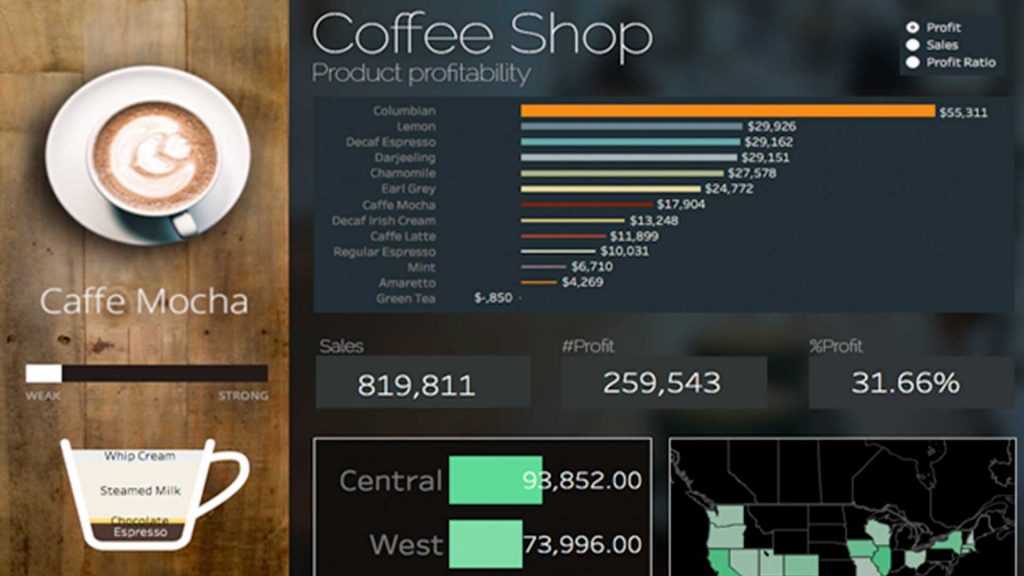
3. Organize
When designing your dashboard layouts keep in mind that people need to focus on a starting point to explore your data story. UI and UX designers use a concept called a “hero image” to address users’ need to focus. It’s the main focus of the layout that everything else on the page supports. We can use this principle when designing dashboards as well. Build “Data Heros” by making the data view that tells the simplest and most important piece of your data story front and center by giving the most real state on the dashboard. All other data views should support the “Data Hero”.
Another great strategy is to design your dashboards like a website by placing navigation, filters, KPI’s and other key metrics in the same places that people are already use seeing. Keeping a consistent layout to all your dashboards will make it easier for people to engage with your data story.

4 Use Actions not Filters
The simplest way to gain performance and improve user engagement is to start using dashboard actions over filters. This not only reduces the data processing time but it enables and encourages people to directly interact with the data without reloading the dashboard or losing the relationship to all the other data points on the screen.

5. Data Story Colors
Colors have a huge impact on us, sometimes we don’t even know it happening. Take for Stoplight colors as an example, Red = Stop, Green = Go and Yellow = caution. Don’t fight it, embraces it! Use colors that invoke the feelings in people that people already have ingrained in their daily lives.
Also, take the time to design your data color story. Be sure to use the same color of the same metric every time. This way the user isn’t confused or has to relearn the data every time they see a new dashboard. And never use your corporate colors in the data story. Restrict these colors to your background template. You don’t want people associating success for failure metrics with your companies image.
