When Radial Pie Charts Serve Up More Style Than Substance
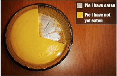
Tableau Public is promoting radial pie charts and I don’t understand why. Radial charts are just tarted-up pie charts and pie charts are, on their own, terrible ways to communicate more than two pieces of data. Making a radial chart is like adding chaos on top of confusion. Has anyone ever seen, designed, or used a radial chart that facilitated understanding and action faster? (If so, please share in the comments! I’d love to see.)
Pie charts aren’t great for a variety of reasons but among the top are:
- Determining actual figures is difficult
- Labeling sections is difficult, and can end up looking sloppy
- Too many pieces of data creates a visual unclear chart
- You can’t use negative amounts in a pie chart
Radial charts can be visually beautiful, creative, and interesting, but as an effective visual communication tool they’re a crust, I mean bust. The whole point of data visualization is to communicate something clearly and efficiently, aesthetics are secondary. That’s why bar charts are so popular: they work. I’m not saying every dashboard needs to be only bar charts – there are tons of fun charts out there that can be visually more interesting than bars and still be meaningful, it just depends on what the goal of your data story is.
But when you optimize for style over substance, you lose exactly what you started off trying to achieve: understanding.
If you’re interested in reading more about this topic, check out this article by Steven Few.